7 Bestselling Unusual Themes for WordPress

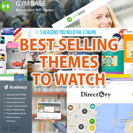
There are some things that are truly unique and outstanding that they can’t help but stand out and rise to the top of the heap. Here are some of the best selling WordPress themes that owe their popularity to a unique niche that they fill.

X Theme

Dubbed as Themeforest’s most popular new product, this theme presents itself as the ultimate WordPress theme. The claim’s validity is backed by real world results and real time feedback from its satisfied users who have experienced the endless customization options available to its owners. While it offers a lot to those who want to dabble into the “nuts and bolts” of the theme, X also offers strong solutions for those who just want to get something up and running on their sites in no time. The theme has 3 predefined stacks that can be easily tweaked to give newbies and non-techies a “made by a professional” look for their websites. X offers features that have set the standard and raised the bar as far as WordPress themes go. Not surprising considering the experts who have given their inputs in the development of the theme not to mention the developer’s open ears to customer feedback. It is also not surprising that many already consider this as the last WordPress theme they will ever need.

Directory

This unique theme allows you to easily set-up an online directory portal listing categorized items of any type. You can have a directory of shops, websites, companies and more. This may be accomplished conveniently with from a frontend like admin panel giving you a more user friendly set-up experience. Visitors will find Directory a convenient reference resource as it delivers information in a concise, convenient manner. Entries are displayed as pins on a google map of the locale of interest. Alternatively visitors may search from a search box or browse off a category of entries. Directory comes with a lot of ad spaces so you can cash in on the traffic your content generates. This theme is integrated with Paypal so administering payments from advertisers and listed establishments isn’t a hassle. With more than 6000 satisfied users, Directory is considered the Best selling directory portal theme on themeforest.

Gymbase

This theme has been around for quite a while but remains a bestseller in its own right because of its special qualities. First and foremost it’s a Gym theme – unique and not like the rest. It addresses a viable niche market – the health and fitness market – where gym owners can easily create a website that can service players in this industry. Some of the useful features the theme has include: a timetable plugin included that allows members and visitors to plan the classes they will attend, Gymbase also displays the pricing for classes, features that allow updates for its members regarding upcoming classes, an easy to use admin panel equipped with a color picker to help you create your own custom look, and everything else you need to run a health and fitness website.

Academy

Designed to be a learning management solution for educational or training institutions to maximize the power and reach of the internet, Academy enables you to sell and share knowledge online. This theme gives you the platform to deliver classes and lessons to interested parties. Academy allows you to upload media content and documents as well as to encode quizzes and tests to check for your subscribers competency. You are also able to check the progress of your students, monitor the courses they take, as well as, administer payments. This theme is integrated with WooCommerce. Academy is an invaluable tool especially today, as more and more people turn to e-learning as a means of acquiring new skills and education.

Fundify

Fundify is the first WordPress theme designed for crowdfunding. This enables you to have a websites in the likes of Indiegogo and Kickstarter where parties can setup campaigns to raise funds for causes they support. Fundify allows you to setup campaigns for a fixed amount of money where supporters are only billed if the minimum target amount of the campaign is reached. Alternatively, the theme also enables flexible campaigns where whatever amount pledged is collected. Fundify also allows you to administer rewards to those who support your causes. The theme integrates with Paypal and easy digital downloads which makes it convenient for supporters to finance causes and advocacies that appeal to them.

Knowhow

With knowledge and information being an important commodity nowadays, it is not surprising to find a knowledge base theme in this list. What makes Knowhow special is that it enables you to setup your own knowledge base with ease and convenience while maintaining the privacy and control of information not available on public Wikis. You can list your content in the form of an FAQ. Knowhow also allows users to search by question or by topic which makes searching more convenient. Not your ordinary WordPress theme.

Jobify

Globalization and the internet have made the job market more competitive. Jobseekers have a need to display their resumes online so they can get the best jobs available. In a similar fashion, employers need to get the best talent available. Jobify is a job exchange solution used by top companies like dropbox to acquire the best talent globally. Employers can subscribe to your site for posting privileges. Jobseekers can post their resumes in response to job postings. This theme integrates with WooCommerce and Contact forms plugins to give you the best in payment and input management.


Friendly, Optimized, Ready – Really? SEO and your WordPress Theme

A lot of premium WordPress themes claim to be SEO friendly, SEO optimized, or SEO ready. Did you know that WordPress is one of the most SEO friendly CMS (content management systems) publishing platforms on the internet? SEO is actually a built in feature within WordPress, ready to embrace search engines straight out of the box. But what is SEO really all about? Is it enough to just have a pretty WordPress theme to boost your site’s traffic? Why the need for 3rd party plugins if WordPress is SEO friendly from the beginning?

Search Engine Optimization

There are many ways to define SEO and here are a few:

Search engine optimization (SEO) is the process of affecting the visibility of a website or a web page in a search engine’s “natural” or un-paid (“organic”) search results.[jargon] In general, the earlier (or higher ranked on the search results page), and more frequently a site appears in the search results list, the more visitors it will receive from the search engine’s users. SEO may target different kinds of search, including image search, local search, video search, academic search,[1] news search and industry-specific vertical search engines.
(source: Wikipedia)

SEO is the practice of improving and promoting a web site in order to increase the number of visitors the site receives from search engines. There are many aspects to SEO, from the words on your page to the way other sites link to you on the web. Sometimes SEO is simply a matter of making sure your site is structured in a way that search engines understand.
Search Engine Optimization isn’t just about “engines.” It’s about making your site better for people too.
(source: seomoz.org)

Simply put, SEO helps you connect with your target market. It boils down to being “ find-able” to those who are already looking for you. Unfortunately, it is also true that if your website is “out of sight” it is definitely “out of the mind” of these seekers and potential customers. Even if you do “build” a beautiful website, they won’t necessarily “come” unless they are family and friends who just want to be supportive of you. Bottom line, no matter how pretty your website is, you need SEO to make sure that your beautiful website can be found and appreciated.

Another culprit to your WordPress site being “out of sight, out of mind” of the search engines is the WordPress theme you use. Not all premium themes are SEO optimized, friendly, or ready even if they claim to be so. Yes, WordPress is SEO friendly by default but if you install, customize and use various theme to meet your own needs, your “premium” theme might actually break some of those useful search engine features and do more harm than good to your rankings.

Here are some SEO basics straight from Google’s mouth to make sure your WordPress theme is truly SEO friendly, optimized and ready:

Create unique, accurate page titles

Choose a title that effectively communicates the topic of the page’s content. Each of your pages should ideally have a unique title tag, which helps Google know how the page is distinct from the others on your site. Titles can be both short and informative. If the title is too long, Google will show only a portion of it in the search result.

Make use of the “description” meta tag

Write a description that would both inform and interest users if they saw your description meta tag as a snippet in a search result.

Improve the structure of your URLs

URLs with words that are relevant to your site’s content and structure are friendlier for visitors navigating your site. Visitors remember them better and might be more willing to link to them. Use a directory structure that organizes your content well and makes it easy for visitors to know where they’re at on your site.

Make your site easier to navigate

Make it as easy as possible for users to go from general content to the more specific content they want on your site. Add navigation pages when it makes sense and effectively work these into your internal link structure. Controlling most of the navigation from page to page on your site through text links makes it easier for search engines to crawl and understand your site.

Offer quality content and services

Users enjoy content that is well written and easy to follow. It’s always beneficial to organize your content so that visitors have a good sense of where one content topic begins and another ends. Breaking your content up into logical chunks or divisions helps users find the content they want faster. New content will not only keep your existing visitor base coming back, but also bring in new visitors.

Write better anchor text

The anchor text you use for a link should provide at least a basic idea of what the page linked to is about. Aim for short but descriptive text-usually a few words or a short phrase. Make it easy for users to distinguish between regular text and the anchor text of your links. Your content becomes less useful if users miss the links or accidentally click them.

Optimize your use of images

Like many of the other parts of the page targeted for optimization, filenames and alt text (for ASCII languages) are best when they’re short, but descriptive. If you do decide to use an image as a link, filling out its alt text helps Google understand more about the page you’re linking to. Imagine that you’re writing anchor text for a text link. An Image Sitemap file can provide Googlebot with more information about the images found on your site. Its structure is similar to the XML Sitemap file for your web pages.

Use heading tags appropriately

Heading tags (not to be confused with the HTML tag or HTTP headers) are used to present structure on the page to users. There are six sizes of heading tags, beginning with h1, the most important, and ending with h6, the least important (1).

Similar to writing an outline for a large paper, put some thought into what the main points and subpoints of the content on the page will be and decide where to use heading tags appropriately. Use heading tags where it makes sense. Too many heading tags on a page can make it hard for users to scan the content and determine where one topic ends and another begins.

Make effective use of robots.txt

Restrict crawling where it’s not needed with robots.txt. A “robots.txt” file tells search engines whether they can access and therefore crawl parts of your site.

Be aware of rel=”nofollow” for links

Setting the value of the “rel” attribute of a link to “nofollow” will
tell Google that certain links on your site shouldn’t be followed
or pass your page’s reputation to the pages linked to.
Nofollowing a link is adding rel=”nofollow” inside of the link’s anchor tag.

Notify Google of mobile sites

Configure mobile sites so that they can be indexed accurately. Verify that your mobile site is indexed by Google. A Mobile Sitemap can be submitted using Google Webmaster Tools, just like a standard Sitemap.

Guide mobile users accurately

When a mobile user or crawler (like Googlebot-Mobile) accesses the desktop version of a URL, you can redirect them to the corresponding mobile version of the same page. If you redirect users, please make sure that the content on the corresponding mobile/desktop URL matches as closely as possible.

Promote your website in the right ways

Sites built around user interaction and sharing have made it easier to match interested groups of people up with relevant content. As people discover your content through search or other ways and link to it, Google understands that you’d like to let others know about the hard work you’ve put into your content

Make use of free webmaster tools

Improve the crawling and indexing of your site using Google’s free Webmasters Tools or other services. Google offers a variety of tools to help you analyze traffic on your site.

These are the SEO basics that you can use to assess whether your WordPress theme or your website is optimized or not. If you would like to read more on these SEO basics, check out Google’s free pdf resource “Search Engine Optimizer Guide”.


WordPress Design For A Global Market

Design is subjective. There are generally accepted design principles that govern the design community and serve as guides to evaluating “correct” design. However, not all of them are totally applicable to specific clients especially when Western taste buds meet Eastern culture. But when and where shall the ‘twain ever meet if beauty and design aesthetics are wrapped deeply in mores and culture?

This is the cross cultural challenge that web designers need to face in order to remain competitive in today’s global market place.

West, Meet East

Before the West was, the East was. Two of the world’s oldest civilizations, China and India, are also two of the fastest and most robust economies today. According to Census.gov, as of 2014, China and India ranked as the top two countries with the highest population in the world. China ranked first with 1.3B (population) with an approximate 42.3% Internet penetration, followed by India with 1.2B (population) with an approximate 81% Internet penetration. Approximately 1 billion internet users from these 2 (right to left, top-to-bottom reading) countries alone. And if theme developers do the math, even if at 1% of a billion internet users, that’s still a lot of WordPress themes right there. Too many to ignore.

Global Market Local User Design

We’ve talked about defining your target market and directing your business to reaching your specific demographic. Once you have that down pat, it’s probably time to think of expansion and consider widening your net a little further. To go a little more granular and target the local user.

With WordPress powering over 21% of the Internet and being one of the most user friendly and reliable CMS systems existing today, aside from the fact that it is free, more and more Internet users are looking to it as their platform of choice.

With that, the popularity of WordPress has crossed over into multi language markets despite having been around for only a decade and catering mainly to users of modern languages which are generally left to right in direction. Hence, the increase in demand for WordPress themes with RTL or WPML features or WP plugins that provide this functionality.

The diversity of WordPress users from all across the globe is becoming an important factor in developing themes that are relevant culturally and technically suited to these users local needs. As responsive once was a premium feature that has now become a standard feature in all WordPress themes, so shall the multi language and RTL feature become.

The Design Approach

The WordPress theme development marketplace has grown considerably with designers coming up with better and more user friendly designs that match the general needs of WordPress users. There is a huge pool of WordPress themes available for, generally, almost every type of website need out there. But there is still room to grow for more cross-cultural friendly options.

Below are some design elements that designers need to consider when creating themes that are responsive to culturally diverse user groups. (Notes culled from W3.org and Sitepoint.com)

  • Language
    – Languages don’t have a direction. Scripts have a writing direction, and so languages written in a particular script, will be written with the direction of that script. Languages can be written in more than one script.
  • Typography – fonts and characters
    – Typography can look “busier” to Western eyes than to Asian readers because many Asian scripts don’t have separate upper and lower cases. Some languages have scripts that are not alphabetic at all, but which express an idea rather than a sound. Occasionally, it’s necessary for an author to provide readers with pronunciation help for especially rare or awkward characters, usually with an alternative script in small writing above the ambiguous character.
  • Content presentation
  • Styling
  • Usability
  • Navigation
  • Mirror layout
  • Scripts (Left to Right, Right to Left, Top to Bottom)
    – Text direction is another thing that should not be confused with language. In some scripts, such as Arabic and Hebrew, displayed text is read predominantly from right to left, although within that flow, numbers and text from other scripts are displayed from left to right. Knowing the directionality of text, based on the script(s) to be used, is important to web designers and authors, because right-to-left text can be more complicated (for beginners) to work with and the organization and directionality of the page layout are affected. Therefore, knowing the writing direction can be relevant to estimating the work involved to create web pages in a new language.
  • Images and animations
  • Forms
    – Designing forms for an Asian market can have pitfalls for Western developers. For example, it’s common to require both given name and family name and give an error if both are not completed. Many Asian languages write names with family names first and given names afterwards while some have only one name. Also, do not limit the amount of characters in Address fields.
  • Mobile
  • Propriety
  • Color palettes
    – While choosing your colors for your design, keep in mind that certain colors have different connotations across cultures. For example, red is lucky for Chinese people. On the other hand, Thai people will be offended if you print their name in red — it’s the color that monks employ to write names on coffins, so to write someone’s name in red is to “wish them dead”.
  • Symbols and metaphors

For web designers, W3.org International’s tagline sums it up quite well: “Making the World Wide Web Worldwide.” Let’s!


Finding and Establishing your own Niche WordPress “Channel”

The recently held digital marketing conference Traffic and Conversion Summit 2013 was an eye opener to many. Many of the topics discussed were cutting edge and one of the main buzz words that came out of the conference was “channelization”.

The Channelization of Everything

What do we mean when we say “channelization”? Here’s an interesting way to look at it.

Rivers come in lots of different shapes and sizes, but they all have some things in common. All rivers and streams start at some high point. The high point can be a mountain, hill or other elevated area. Water from some source like a spring, snowmelt or a lake starts at this high point and begins to flow down to lower points. As the water flows down, it may pick up more water from other small streams, springs or or from rain or snow melt. These streams may slowly join together to form a larger stream or river. Small rivers and streams may join together to become larger rivers. Eventually all this water from rivers and streams will run into the ocean or an inland body of water like a lake.

River engineering is the process of planned human intervention in the course, characteristics or flow of a river with the intention of producing some defined benefit. People have intervened in the natural course and behaviour of rivers since before recorded history – to manage the water resources, to protect against flooding or to make passage along or across rivers easier.

Channelization of a stream may be undertaken for several reasons. One is to make a stream more suitable for navigation or for navigation by larger vessels with deep draughts. Another is to restrict water to a certain area of a stream’s natural bottom lands so that the bulk of such lands can be made available for agriculture. A third reason is flood control, with the idea of giving a stream a sufficiently large and deep channel so that flooding beyond those limits will be minimal or nonexistent, at least on a routine basis.
(source: Wikipedia)

In today’s digital market, how then, does this concept apply to finding or even creating your own niche WordPress stream or channel?

Let’s take a look:

Product distribution (or place) is one of the four elements of the marketing mix. Distribution is the process of making a product or service available for use or consumption by a consumer or business user, using direct means, or using indirect means with intermediaries. The other three parts of the marketing mix are product, pricing, and promotion. Distribution of products takes place by means of channels. Channels are sets of interdependent organisations (called intermediaries) involved in making the product available for consumption.

Today’s digital economy is shifting towards “channelization” – the way products are made available for public consumption. Because of the way business is evolving, what worked years ago may no longer work today. What was effective yesterday may already be obsolete today. Interestingly enough, starting your own business and distributing your own products has never been easier. However, the challenge of independent business owners or new players in the eCommerce arena is being discovered and being able to establish their own loyal market base. Creating your own stream or river from scratch is like pushing a boulder uphill everyday. This is where the shifting or the channelization occurs.

Today, the traditional trader can start off his business by taking advantage of these established “high starting points of distribution” like Amazon or Ebay, plug in to their channel, utilize their structure and distribution network to launch or introduce a new product or project.These powerful distribution channels have significant traffic and extensive networking connections to give your business a boost in the right direction. Once the channel is strong enough and the customer base is established, the business owner can spin off and establish his own business base according to his own terms. On the other hand, DIY-ers and boutique type businesses can create their own online stores in niche channels like Etsy. Other types of businesses can use other distribution channels such as KickStarter, AngelList, CafePress or Barkbox. How to get started? All it takes is to register.

What about digital goods such as WordPress Themes, Plugins and other types of digital products? New players in the WordPress themes business have found opportunities to introduce themselves and pool their work portfolio through established WordPress marketplaces or “channels” like ThemeForest with very little startup capital. The key, really, is to draw a loyal crowd or “traffic”, establish connections, and service them so that their conversion as long-term customers or customers for life will be cemented.

Bottomline, in today’s digital economy, having a good product is great, knowing your distribution channels is better, but having a good product + distributing thru the right channels + creating the media (email lists of customers) = the best starting point for you to build your own niche business and your brand.


Responsive Web Design (RWD) vs Adaptive Web Design (AWD)

We’ve heard the terms Fluid, Adaptive, and Responsive used interchangeably when describing a theme’s ability to resize according to browser specs or device (mobile or not) size. Are they really different from one another or are they referring to the same characteristics found in themes described as such?

What is Responsive Web Design (RWD)? Responsive Layout?

Let’s take a closer look.

Responsive web design (often abbreviated to RWD) is an approach to web design in which a site is crafted to provide an optimal viewing experience—easy reading and navigation with a minimum of resizing, panning, and scrolling—across a wide range of devices (from desktop computer monitors to mobile phones) – Wikipedia

Responsive design is the methodology behind making a website respond to whatever platform you are viewing it on regardless of resolution and orientation. It may change how certain elements display but it will not remove elements or change the core functionality of their behaviours. Responsive design uses a fluid grid and it is usually possible entirely through HTML and CSS, without the need for DOM (Document Object Model) manipulation. – Matthew Freeman

According to Ethan Marcotte, The 3 Elements of Responsive Web Design are:

A flexible, grid-based layout – A layout based on proportions rather than absolutes; uses a flexible grid, which in turn ensures that a website can scale to a browser’s full width.

Flexible images and media – Layouts based on percentages resize gracefully according to the size of the browser window rendering them. However, it is problematic to ensure that the content within a site resizes.
Images and media should scale with the flexible grid; images that work in a flexible context, whether fluid themselves or perhaps controlled through overflow mechanisms. CSS addresses this problem with its max-width property

Media queries – Content based breakpoints; optimize the design for different viewing contexts and spot-fix bugs that occur at different resolution ranges. CSS3’s media queries directly address these usability problems by allowing browsers to serve different styles for different viewing contexts. CSS3 greatly expands support for media queries, adding the ability to target media features such as screen and device width and orientation.

These 3 elements of Responsive Web Design find their way into 3 different types of Responsive (RWD) Layouts:

The Basic Fluid Lay­out
Con­tent con­tin­u­ally flows or adjusts in a word-wrap fash­ion as screen width is increased or reduced. There are no “dis­tinct” dif­fer­ences in con­tent pre­sen­ta­tion. Fluid layouts are dynamic and user sensitive – adapting to the available real estate on the user interface and providing increased content accessibility.

The Adap­tive Lay­out
There are pre­de­fined sizes were dif­fer­ent lay­outs are trig­gered. These are called breakpoints. Typ­i­cally there are three or four break­points to accom­mo­date desk­top, tablet and mobile screen sizes.

The Respon­sive Lay­out
This is a hybrid of Basic Fluid Lay­out and Adap­tive Lay­out. There are pre­de­fined break points, how­ever in between these breakpoints con­tent will flow to expand or con­tract.

According to his article for the Adobe Blog, Carl Sandquist states that:

“Cur­rently, most RWD web sites use Respon­sive Lay­out since it offers a best-of-both-world expe­ri­ence. Con­tent snaps into the appro­pri­ate approx­i­mate posi­tion for a device type (e.g. Tablet) and then fine-tuned adjust­ments are made for the exact screen size on a par­tic­u­lar device.”

What is Adaptive Design (AWD)? Adaptive Layout?

“Adaptive design is the manipulation of layouts to best perform on certain screen resolutions inclusive of elemental removal or behaviour changing techniques. Adaptive design usually requires Javascript to efficiently manipulate the DOM. Javascript can be avoided if you plan on having duplicate on-page elements and then show or hide them based on screen sizes, this might be appropriate for smaller elements but not whole columns or navigation elements.” – Matthew Freeman

“This technique adapts what is displayed depending on the capabilities of the device being used, as well as the screen size. It centres on the context of the user, so even when the same content is used, it is adapted (with some or even all of the design elements changing), depending on whether the user is using a mouse and keyboard or touch screen. AWD also uses different layouts for tablets and mobiles with certain. ‘Responsive’ elements built in to reduce the number of different templates required. AWD can be taken to further extremes with content being completely repackaged and reworded, while images and video are either reworked or completely removed.” – Danny Bluestone

According to Aaron Gustafson, author of Adaptive Web Design, Crafting Rich Experiences with Progressive Enhancement:

“Progressive enhancement isn’t about browsers. It’s about crafting experiences that serve your users by giving them access to content without technological restrictions. Progressive enhancement doesn’t require that you provide the same experience in different browsers, nor does it preclude you from using the latest and greatest technologies; it simply asks that you honor your content (and your users) by applying technologies in an intelligent way, layer-upon-layer, to craft an amazing experience.

He encourages designers to: Think of the user, not the browser.”

Which one is better?

A better understanding of the differences between Responsive Web Design and Adaptive Web Design is a starting point to deciding which solution will work well for you, or your clients, if you are a WordPress professional. Knowing what solutions are available and having the ability to distinguish and implement whichever design approach best meets the specifications of the end user is an important element. Of course, nothing is carved in stone. Future designs may be a combination or a hybrid of both – employing the best features of each one. The goal is to ensure that the user experience at the point of searching and eventually finding your website is the best experience they get at that particular moment – fully hoping that it will be the first of many more visits and not their last.


HOMEPAGE

#1) Elegant Themes – The BEST Deal In WordPress (MUST JOIN) Elegant Themes continues to be our absolute top pick in all of WordPress. To learn more about how you can get 70+ Premium Themes (plus all future themes) for …


HOME

WordPress Themes – May, 2012 Find The Best WordPress Themes! SUN MON TUES WED THURS FRI SAT 1 6 8 9 10 11 12 13 14 15 16 17 18 19 20 21 22 23 24 25 26 27 28 …